

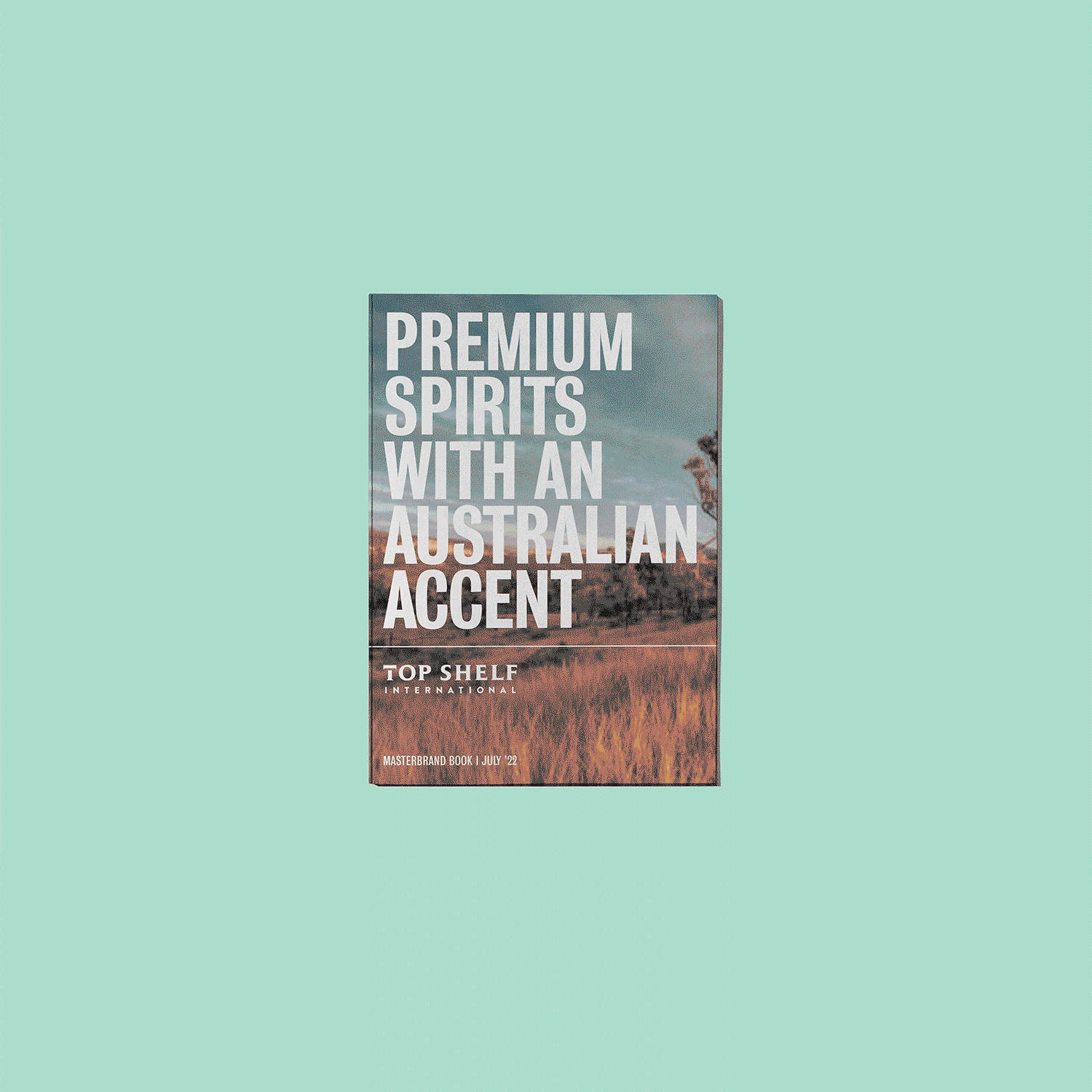
Top Shelf International
Brand Identity and Brand Guideline —
Graphic Design and Art Direction

The Task
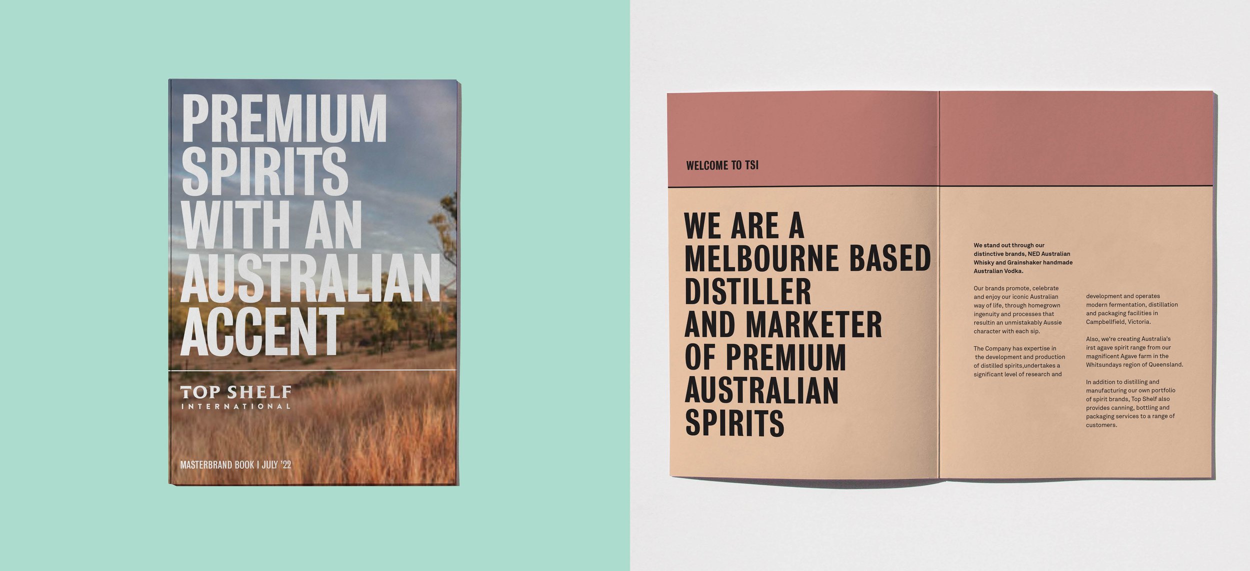
Top Shelf International Australia, kicking off in 2014, first made waves with their whisky brand "NED." As they grew and set their sights on the American market, they wanted to shake things up a bit. The old look, all copper tones and "blokey" vibes, needed a modern makeover.
They were after something fresh, exclusive, and totally new, but with one small condition: the logo had to stay put.
The Work
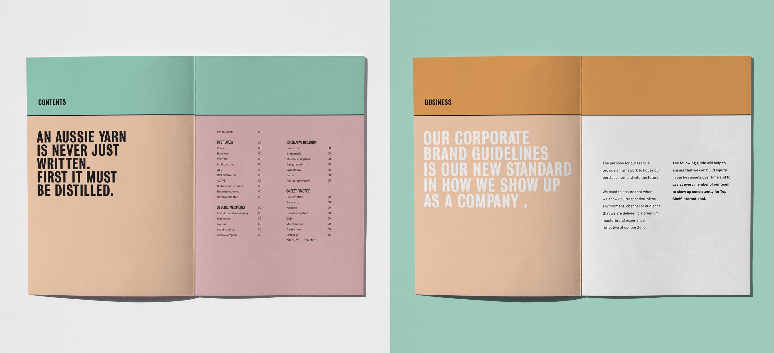
I redesigned their brand guide with a simple grid, taking cues from the "T" in the TSI logo. The result? fresh Australian-inspired colors and a bold font to give the brand some serious punch.


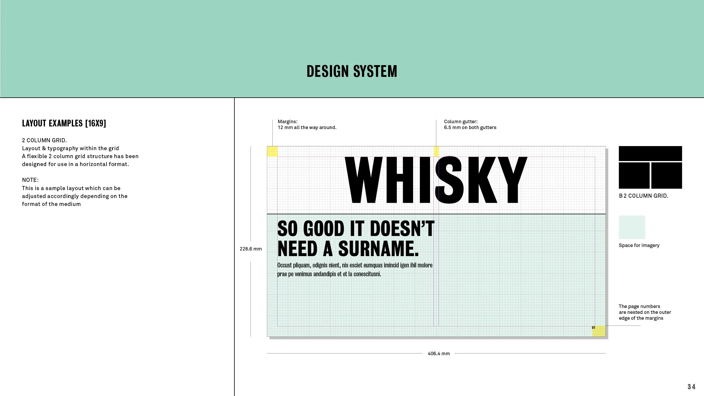
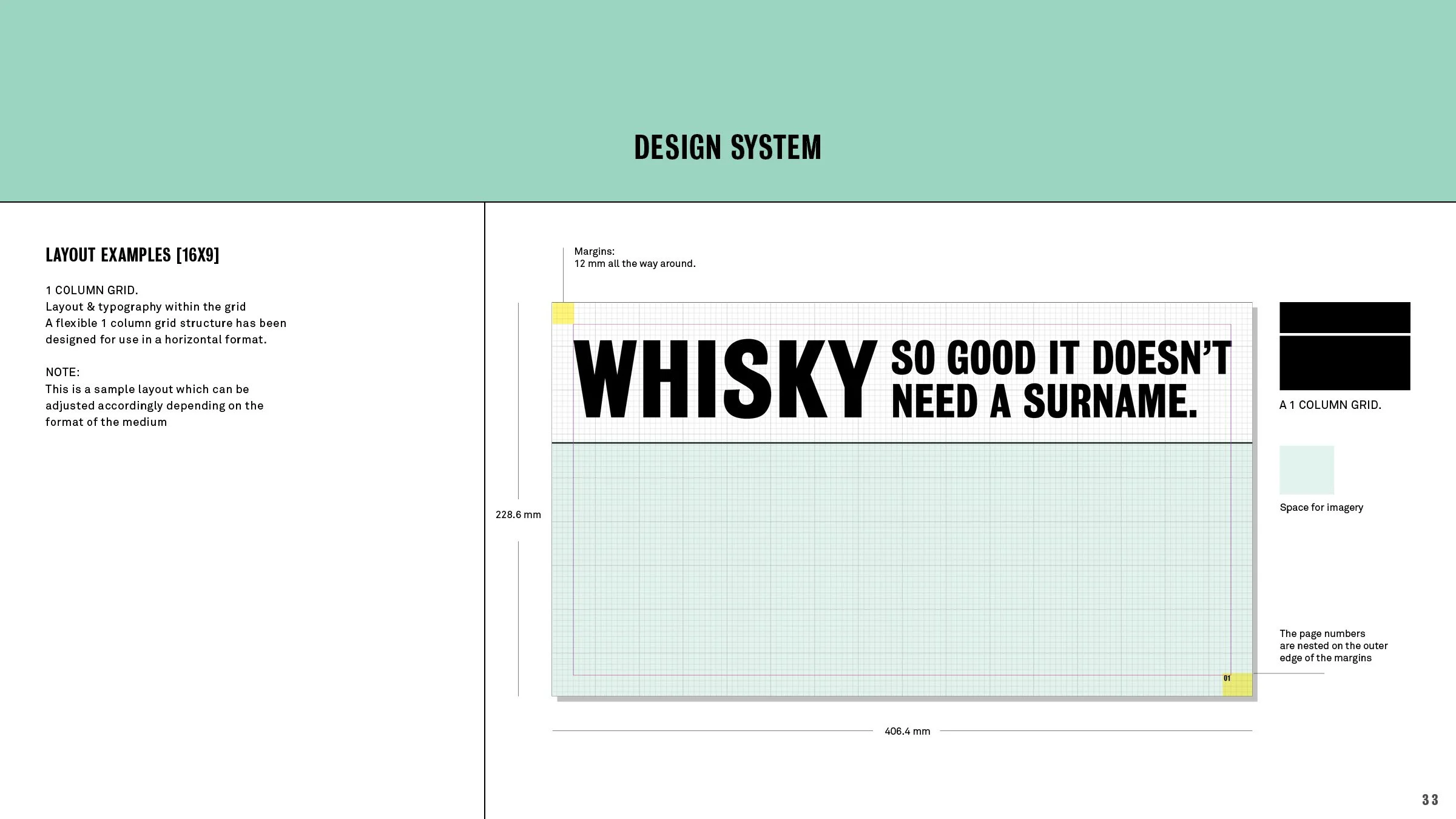
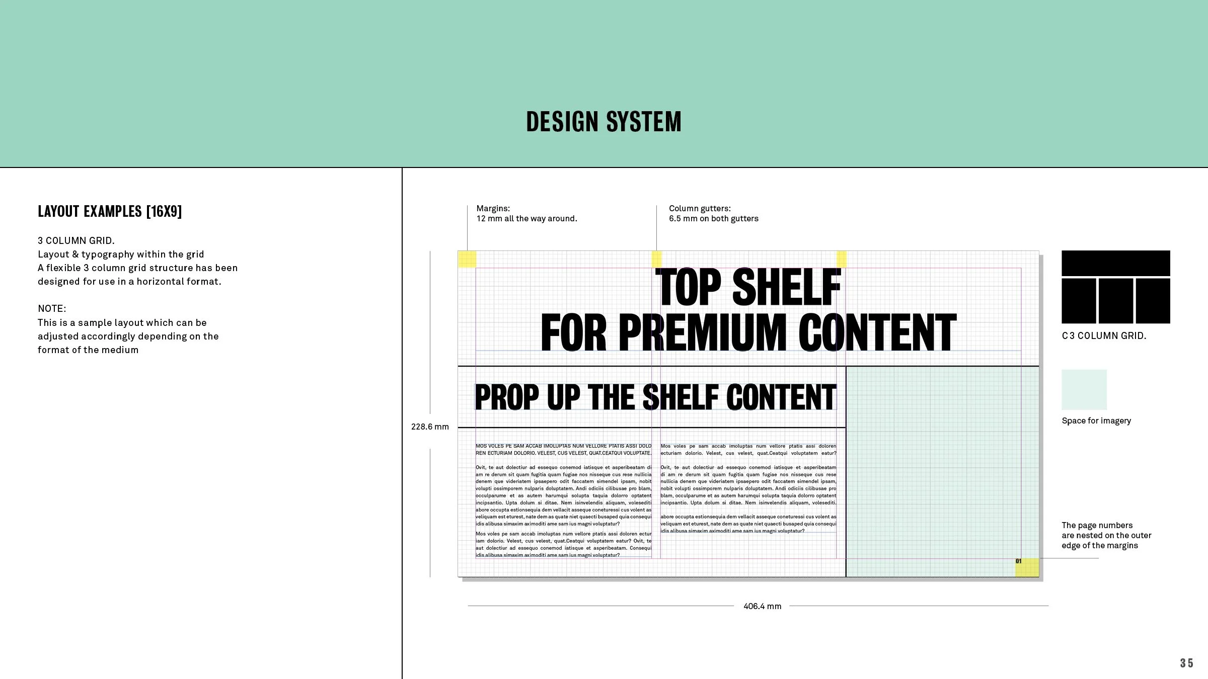
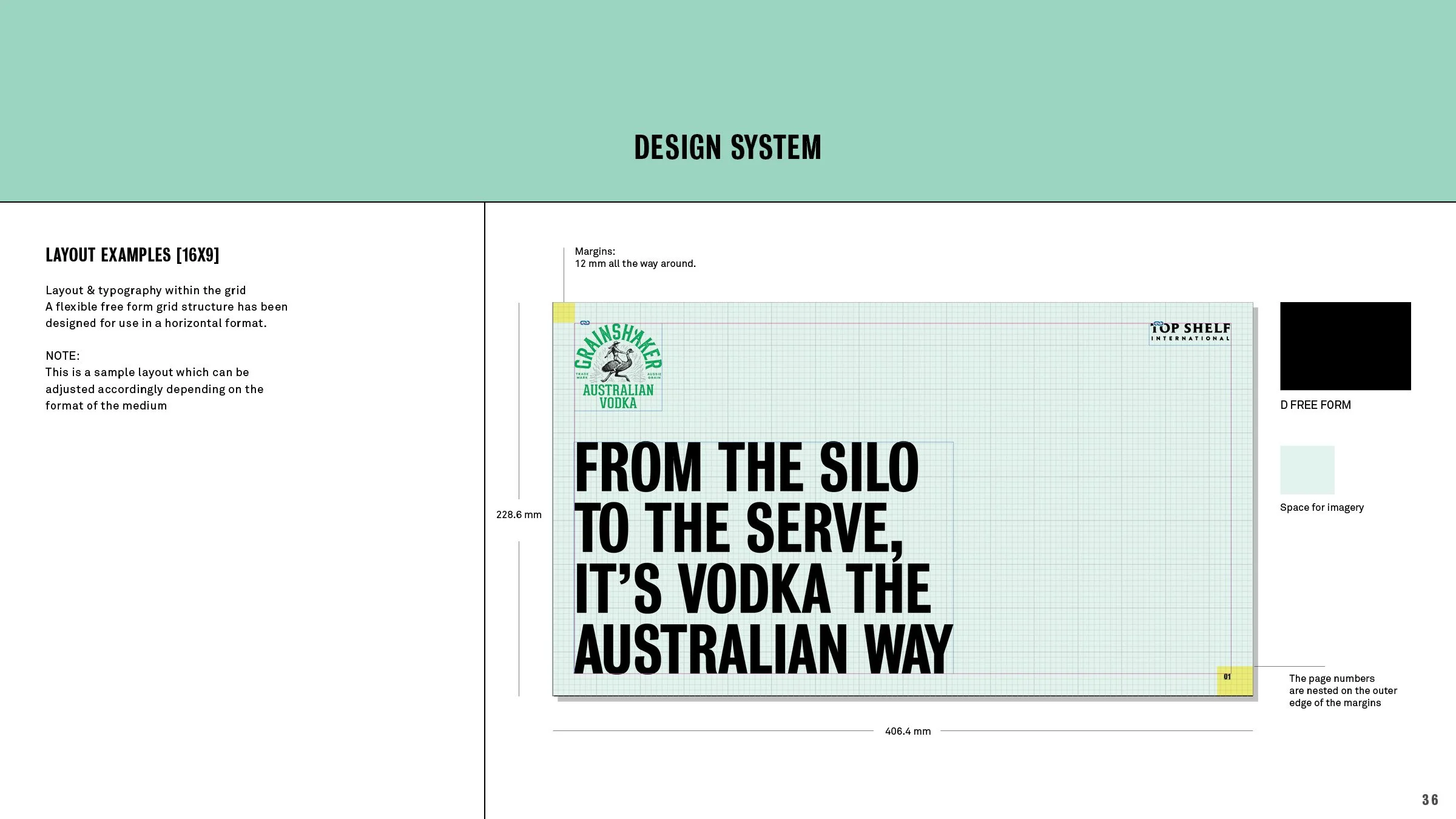
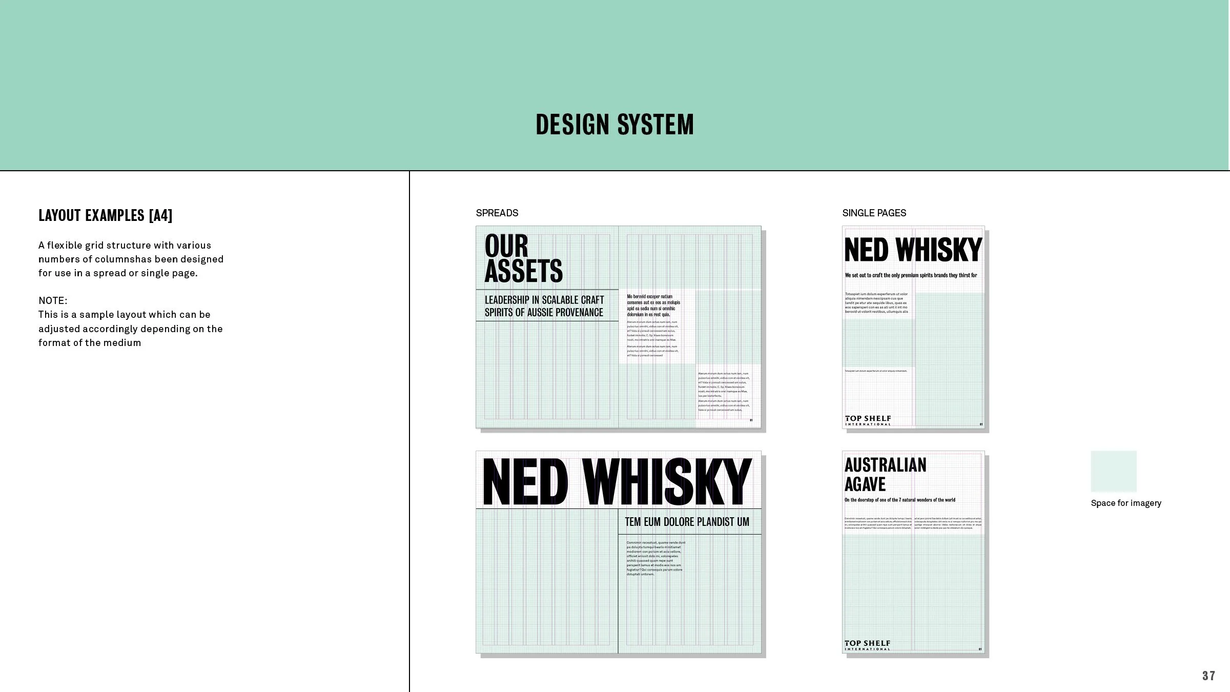
The Grid
The design grid establishes a structured framework, guiding the placement of elements with defined columns, gutters, and modules to ensure cohesive layout organization and visual harmony.
The Copy
Collaborating with the award-winning Australian copywriter Anthony Moss, our tone of voice is light-hearted yet proudly Australian.


CLIENT The Brand Terminal GRAPHIC DESIGN PARTNER Dan Dimarco STRATEGY Kelly Conkright COPY Anthony Moss